“The redesign captured exactly what we do—build belonging. Our leads now come in understanding our value before we even get on a call.”
LLeadership Team
Sylva
110%
More Lead Submissions
50%
Lower Bounce Rate
3x
Service Page Visits
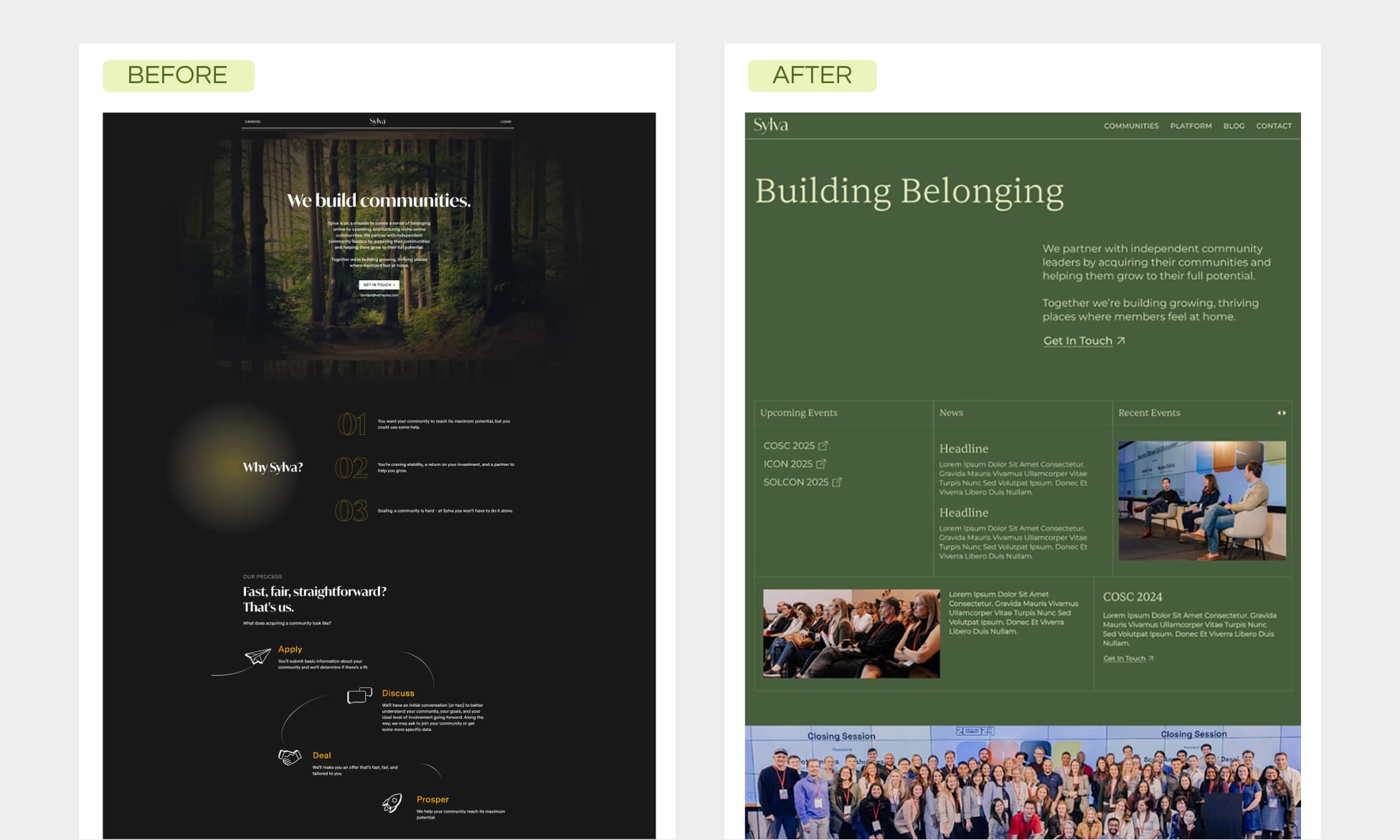
The Challenge
Sylva helps organizations build thriving communities, but their own website was a conversion black hole. Dark, moody forest imagery created atmosphere but killed readability. "We build communities" said nothing about how or for whom. CTAs were vague ("Get in Touch") and buried below the fold.
The irony wasn't lost on us: a community-building expert whose website felt lonely and unclear.
Our Approach
We flipped the visual strategy entirely—from dark and atmospheric to light, warm, and welcoming. The new design needed to *feel* like community: real photos of real people, clear pathways to engagement, proof that this actually works.
We also restructured content around Sylva's dual offering: consulting services AND their Miitra platform.
The Solution
"Building Belonging" became the new headline—emotional but specific. Below it, the homepage now showcases upcoming events, community photos, and a clear service breakdown (Strategy, Growth, Technology).
Real testimonials replaced generic copy. The CTA changed from "Get in Touch" to "Build Your Community"—action-oriented and benefit-focused.
The Results
Conversions:
- Lead form submissions increased 110% within 90 days
- Bounce rate cut in half (68% → 34%) with improved readability
Engagement:
- Service page visits up 3x from clearer navigation
- Sales team reported leads arriving "already educated" on offerings
Client Feedback
“The redesign captured exactly what we do—build belonging. Our leads now come in understanding our value before we even get on a call.”
— Leadership Team, Sylva